
After the conclusion of the design and illustration stage of the elements, I enlarged and arranged them on A3 layouts to prepare them for printing on thicker paper. The Snow Lion background and the base of the pop up was to be printed on A2 layouts.

A3 Print Layout #1

A3 Print Layout #2

A3 Print Layout #3

A3 Print Layout #4

A3 Print Layout #5
Initially, I printed out rough actual sized copies of the coloured illustrations on plain sketch pad thick paper to try out the mechanism in a larger mock-up. I used thick paper strips as the supports for the elements on the mock-up. They were measured and cut according to the distances required.
As I tested the effectiveness of the supports, I moved on to work on the final installation of the pop up elements. In the process, I switched to using transparency strips instead of paper strips as stronger support for the pop up mechanism. Besides, since the pop-up required multiple layers to create depth, the transparency strips worked better aesthetically as they did not serve as a hindrance to the viewing of the scenery while the paper strips obscured the details behind them. For the front-most elements, I created a spring-like mechanism using plastic strips to enable the elements to spring up automatically when the book was opened.

Pop Up Mechanism testing
Besides, I hand drew a few little girl figures on glossy thick paper and stuck them on the pop-up layout purposefully. The girls were depicted as doing all kinds of activities such as climbing the mountains, battling the dragon and traversing through the forest. These silhouettes were representation of the little girl and myself in the story.
![Snow Lion Realm [Final Pop Up Artwork]](https://themistyjourney.files.wordpress.com/2014/07/img_2440.jpg)
Snow Lion Realm [Final Pop Up Artwork]
![Final Artwork [Zoomed in] #1](https://themistyjourney.files.wordpress.com/2014/07/img_2393.jpg)
Final Artwork [Zoomed in] #1
![Final Artwork [Zoomed in] #2](https://themistyjourney.files.wordpress.com/2014/07/img_2438.jpg)
Final Artwork [Zoomed in] #2
![Final Artwork [Zoomed in] #3](https://themistyjourney.files.wordpress.com/2014/07/img_2444.jpg)
Final Artwork [Zoomed in] #3
![Final Artwork [Zoomed in] #4](https://themistyjourney.files.wordpress.com/2014/07/img_2448.jpg)
Final Artwork [Zoomed in] #4
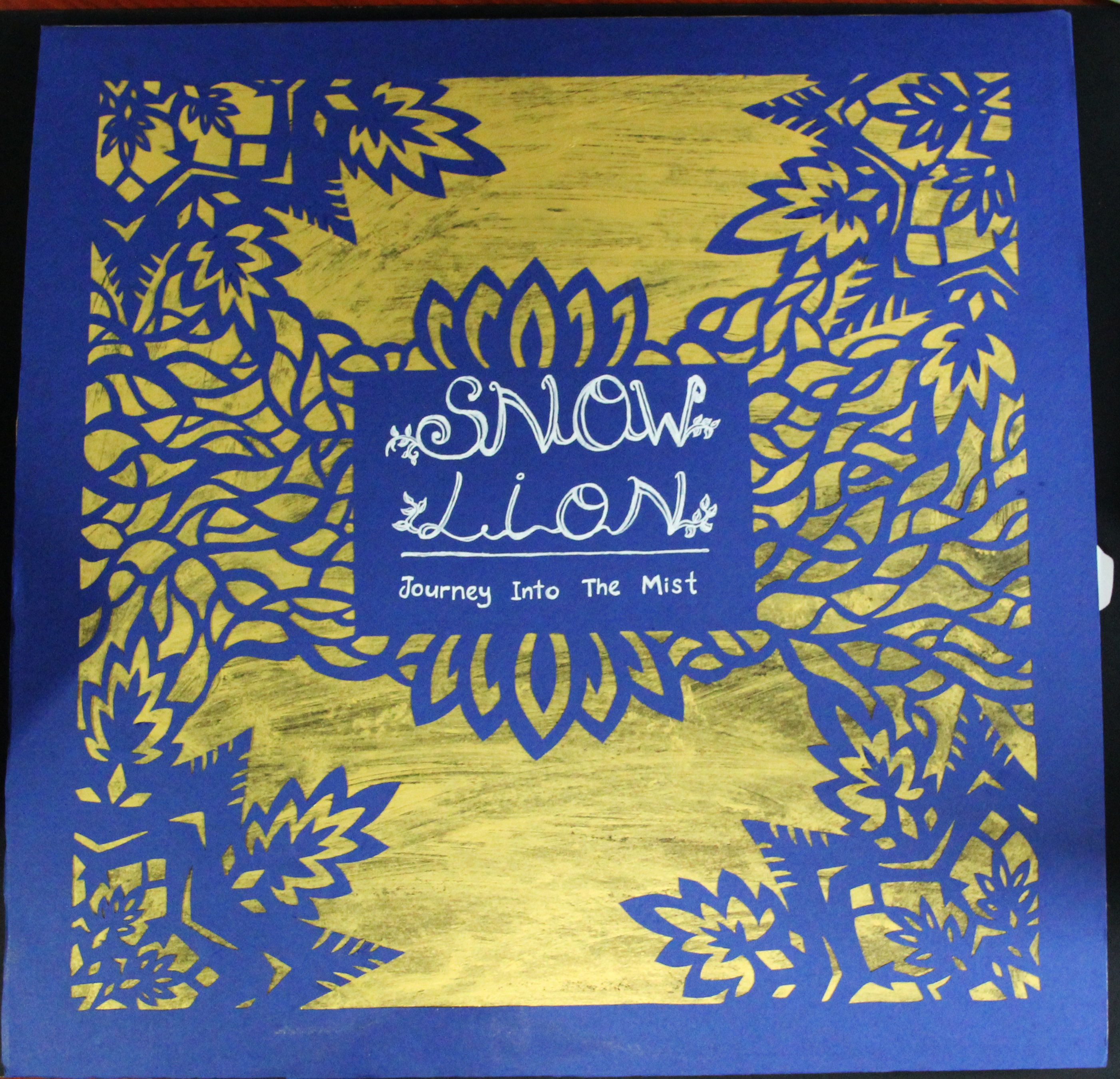
Final Artwork Cover Page – Kirigami

Final Artwork Back Page – Synopsis
Moving on to the publicity of the pop-up artwork, the A1 sized poster was designed to resonate with the theme of Snow Lion. I designed a couple of poster layouts to portray the story of Snow Lion. Zoomed in photos of the final artwork and some of the elements were included in the poster to serve as attractions for the viewers. A short description was also written inside while photos of sketches and screenshots were included within the poster to fulfill the requirements. In the end, the first poster layout was chosen as it is cleaner and more aesthetically pleasing.

Poster Layout Sketches

Snow Lion Poster
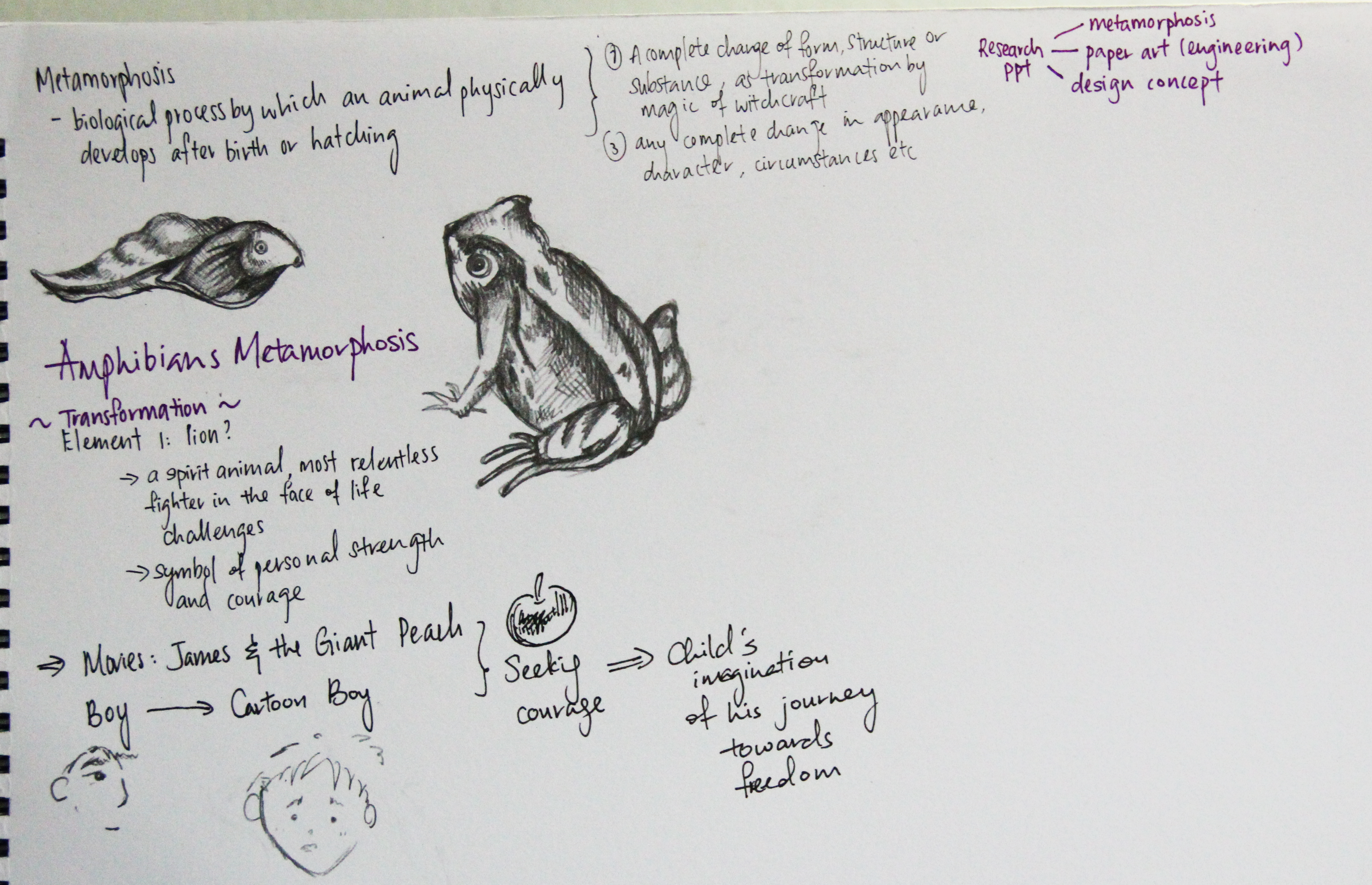
My exposure to new techniques from the process of the project allowed me to learn new skills and gain a deeper understanding of the word “metamorphosis”. Most importantly, it served as a vessel for me to reflect on my experiences and utilize the most effective ways to portray them to the audience. It was an excellent opportunity for me to enhance my skills and push myself over my boundaries to achieve a higher benchmark for my artwork.


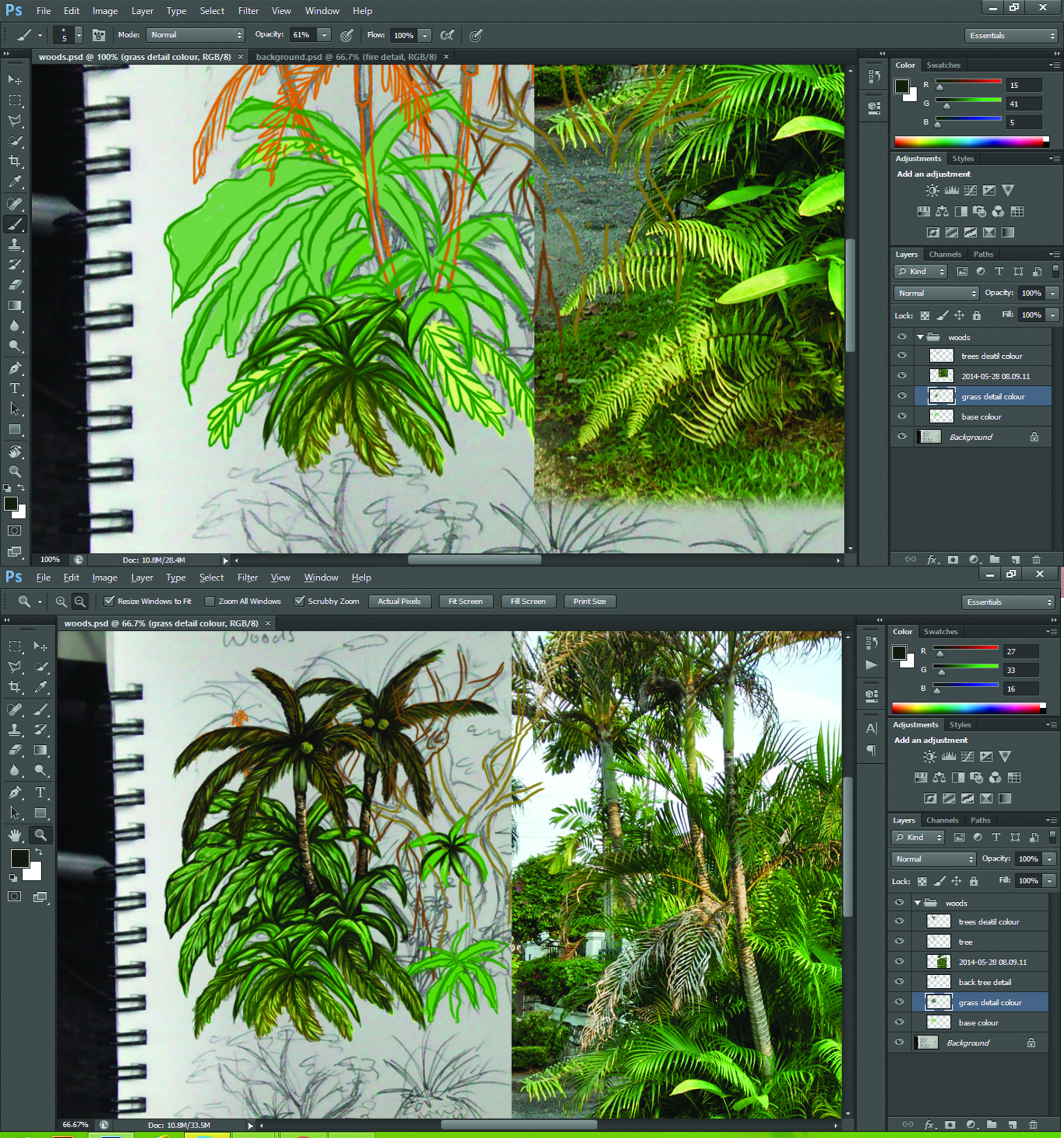
![Layering of Forest Ground [Screenshot]](https://themistyjourney.files.wordpress.com/2014/07/screenshot-2014-06-25-02-28-14.png)


![River Illustration [Screenshot]](https://themistyjourney.files.wordpress.com/2014/07/screenshot-2014-06-25-00-51-10.png)


